Comparisons
Best Image Format for Blog Featured Images
Featured images are one of the most visible media assets on a content site, so the format needs to balance speed, clarity, and shareability.

The short answer
For many modern blogs, WebP is the strongest featured-image default because it keeps article templates lighter without sacrificing quality unnecessarily.
What a featured image needs from its format
A featured image usually needs to look good at the top of the article, inside card grids, and inside social previews or Open Graph shares. That means the format should support a clean visual result while keeping the file efficient enough for article templates that may already carry several images.
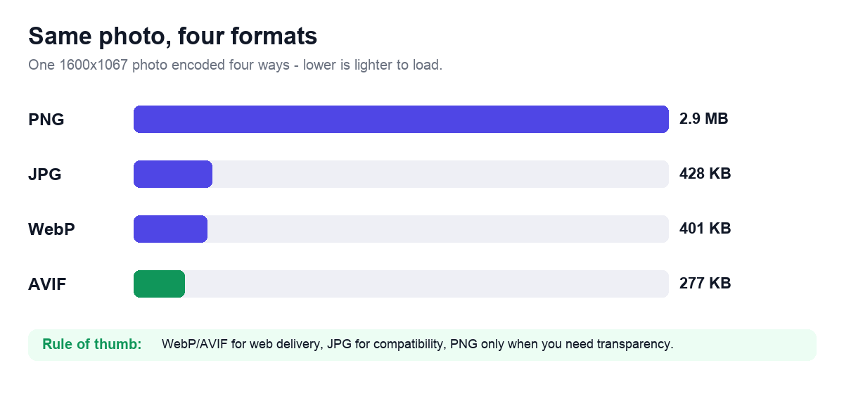
WebP is often a strong default for modern blog delivery, while JPG remains useful when broader compatibility or simpler editorial handling matters. PNG is usually reserved for text-heavy or graphic-style featured images.
- WebP for many modern article and card-image workflows.
- JPG for straightforward photo-led featured images with compatibility needs.
- PNG for text-heavy or transparency-driven editorial graphics.
Real examples
A travel photo at the top of an article often works well in WebP or JPG. A tutorial cover with large text overlays may need PNG or lossless WebP. A blog card grid with dozens of featured images benefits directly from lighter modern formats.
How it affects SEO and page speed
Featured images often contribute a large share of article-page weight, so format choice affects speed and how quickly the content becomes usable.
Developer and workflow notes
Publishing teams should define a featured-image preset that includes ratio, dimensions, and preferred format so editors follow one clear standard.
Common mistakes to avoid
- Uploading design-source PNGs as live featured images without checking size.
- Ignoring how the image behaves inside social previews and card grids.
- Using one giant size for every article template.
- Forgetting to compress after choosing the format.
Exact dimensions for every place a featured image renders
A single featured image is requested at four different sizes, and each one has a fixed target. Master your hero at 1200 px wide and crop derivatives from it, because upscaling a small upload adds weight without adding detail. A 1200 px wide WebP hero at quality 78 lands around 90 to 160 KB for a photograph; the same frame as a baseline JPG at quality 82 runs 140 to 240 KB. Keep one master and let your CMS or your export step generate the rest.
Use a 1.91:1 hero (1200x628) or a 16:9 hero (1200x675) for photographic covers, and a 2:1 hero (1200x600) only if you also publish that frame as the link preview. Square 1:1 crops are for card grids and author archives, not the article top.
- Article hero, full width: 1200x675 px (16:9) or 1200x628 px (1.91:1), target 90 to 200 KB.
- Card grid and related-posts thumbnail: 600x600 px (1:1) or 600x400 px (3:2), target 25 to 60 KB.
- Open Graph and link preview: exactly 1200x630 px (1.91:1), 600x315 minimum, under 5 MB, JPG or PNG only.
- X (Twitter) summary_large_image: 1200x600 px (2:1), 300x157 minimum, under 5 MB.
- RSS and email-digest thumbnail: 600 px wide, JPG, under 80 KB, since many readers do not decode WebP or AVIF.
- Retina hero source: author at 2x (2400 px wide) only when the rendered slot exceeds 800 px, then downscale; below that 1200 px is already enough.
A sized export recipe by image type
Pick the encoder from what the frame contains, not from a site-wide default. A photograph with smooth gradients tolerates lossy compression; a cover with sharp text overlays or a flat-color diagram does not, because lossy WebP and JPG smear high-contrast edges into visible halos at the quality levels that keep files small.
Run the picked file through Compress Image as a final pass and reject any output heavier than the source. If a 1200 px WebP hero still exceeds 200 KB after quality 78, the original was likely a 4000 px camera frame; resize to 1200 px first with Resize Image, then re-encode. For text-heavy covers exported from a design tool as PNG, convert with PNG to WebP in lossless mode, which typically cuts a flat 1200 px PNG from 300 to 600 KB down to 80 to 180 KB with no edge softening.
- Photographic cover: WebP lossy, quality 75 to 82, resized to 1200 px wide, target under 200 KB.
- Cover with large text or logo overlay: WebP lossless or PNG-8, 1200 px wide, target under 180 KB.
- Flat illustration, chart, or screenshot: PNG-8 if under 256 colors, otherwise lossless WebP, 1200 px wide.
- Wide compatibility fallback needed: JPG at quality 82, chroma subsampling 4:2:0, 1200 px wide, target under 240 KB.
- Every type: strip EXIF, GPS, and camera thumbnails on export to shave 8 to 40 KB and avoid leaking location data.
- Never export the hero above 1600 px wide for a standard single-column blog; the extra pixels are discarded by the browser at the rendered slot.
Why your link previews break when the hero is WebP or AVIF
The encoder that is best for the on-page hero is the wrong one for the og:image. Facebook and LinkedIn link-preview scrapers do not reliably decode WebP or AVIF, so a WebP og:image renders as a blank card or falls back to a random in-body image. Point og:image and twitter:image at a dedicated 1200x630 JPG or PNG, separate from the WebP you serve in the article body. X does decode WebP for cards, but matching its JPG keeps one asset working everywhere.
Two byte-level constraints decide whether the card appears at all. Keep the preview file under 5 MB, since scrapers abort larger fetches, and keep critical text inside the central 1080x566 safe area, because some surfaces crop the 1200x630 frame to roughly 1.91:1 on one platform and pad it on another. After publishing, force a re-scrape in the Facebook Sharing Debugger and the X Card Validator; both cache the first fetch for up to 7 days, so a corrected image will not show until you clear it.
Tools that help
Once you have picked a format, finish the job in your browser: convert the file, resize it to the layout you actually need, and compress it to a realistic weight with the tools below.