Comparisons
Best Image Format for Websites in 2026
The best image format for websites in 2026 is usually the one that matches the content, layout, and browser reality of the page, not the format that sounds most advanced in a headline.

The short answer
For many everyday website images, WebP is the strongest default because it is efficient, flexible, and widely usable in modern publishing workflows.
JPG vs PNG vs WebP vs AVIF
JPG is still useful for broad photo compatibility. PNG remains important for transparency and crisp graphic edges. WebP has become the practical default for many modern website images because it balances size and quality well. AVIF can be even more efficient, but support, tooling, and workflow comfort still matter. That means the “best” format depends on what the image contains and how the site publishes it.
The right question is not which format is newest. The right question is which format fits the asset, the browser audience, the publishing workflow, and the performance budget of the page.
- Use JPG for broad compatibility and photographic sharing.
- Use PNG for transparency, screenshots, logos, and UI graphics.
- Use WebP for many everyday web images where size matters.
- Use AVIF when you have checked compatibility and want stronger compression gains.
Real examples
A product photo for a category page often works best in WebP or JPG depending on the fallback requirements. A screenshot in a technical article may still need PNG or lossless WebP so labels remain sharp. A logo or transparent badge should not be forced into JPG just because it is common.
How it affects SEO and page speed
The best website format is the one that supports smaller, right-sized media without harming clarity. That contributes to a faster page and a better user experience.
Developer and workflow notes
Engineering teams should set clear rules for each image slot so editors and marketers do not make the format decision from scratch every time.
Common mistakes to avoid
- Treating AVIF as mandatory before checking actual support and workflow cost.
- Using PNG for photo-heavy site media without a reason.
- Optimizing the format but ignoring oversized dimensions.
- Assuming one format should serve every asset on the site.
Ship two formats from one picture block
Format choice is only half the job. The browser still has to receive a file it can decode, so serve two encodings from a single picture element and let it pick. Order the sources newest-first: an AVIF source, then a WebP source, then an img tag whose src points at a JPG or PNG. The browser stops at the first type it supports and downloads exactly one file, so a Chrome 130 visitor pulls the AVIF and a locked-down corporate browser still gets the JPG.
Concrete payoff on a 1600x900 hero photo encoded at matched visual quality: JPG at quality 80 lands near 210 KB, the WebP source near 150 KB (about 30 percent lighter), and the AVIF source near 95 KB (roughly 55 percent under the JPG). The img tag is the mandatory fallback and the only element that fires alt text, width, and height, so keep it last and never delete it. Set width and height attributes that match the file's real pixel dimensions on that img so the browser reserves layout space and your Cumulative Layout Shift stays at 0.
Width breakpoints and the LCP byte budget
A correctly chosen format still loads slowly if you ship a 3000 px file into a 760 px column. Decode the layout once, generate a width set, and let srcset hand each device the smallest file that still covers its slot at 2x density. For the Largest Contentful Paint image specifically, target under 200 KB of transferred bytes on a 4G connection; that is the threshold above which a sub-2.5 second LCP gets hard to hold on mid-range phones.
Generate these exact widths per slot and store the matching WebP weights as your ceiling:
- Full-bleed hero: 768, 1280, 1920, and 2560 px wide; cap the 1920 px WebP near 180 KB and the 2560 px near 300 KB.
- Content-column figure (about 760 px CSS): 760 and 1520 px; keep the 1520 px WebP under 140 KB.
- Product card or grid thumbnail (about 300 px CSS): 300 and 600 px; keep the 600 px WebP under 45 KB.
- Avatar or icon (about 48 px CSS): 48 and 96 px; PNG or WebP, under 6 KB each.
- Pair each srcset with a sizes attribute that states the real CSS width, such as (max-width: 760px) 100vw then 760px, or the browser assumes 100vw and over-fetches the largest file.
Encoder settings that hit those weights
The numbers above are reachable with ordinary quality settings, not exotic ones. For photographic content, WebP at quality 78 to 82 and AVIF at quality 50 to 55 (AVIF's scale runs darker, so 50 there roughly matches JPG 80) give clean results with no visible blocking at 100 percent zoom. For flat UI graphics, screenshots with crisp text, or any image with hard edges and large solid areas, switch to lossless WebP, which beats PNG by 20 to 30 percent on the same pixels while staying pixel-exact.
Keep web images at 72 PPI; PPI is print metadata and changes zero on-screen bytes, so a 1280 px file is 1280 px whether it claims 72 or 300. Strip embedded color profiles and EXIF on decorative images to recover 3 to 15 KB per file, but preserve an sRGB profile on product and brand photos so colors do not shift between browsers. To apply these without a build pipeline, run a source PNG through PNG to WebP for the lossless graphic path, use Image Format Converter to emit AVIF and WebP from one master, and finish with Compress Image to pull any file that overshot its KB ceiling back under budget.
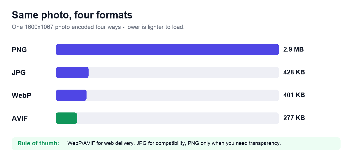
Worked example: one hero image, four exports
Here is the format decision in concrete numbers. Take a single 1600x900 product hero straight from a camera, saved as a 2.4 MB PNG, and run it through the Image Format Converter four ways at matched visual quality. The pixels are identical; only the encoding changes, and the file weight moves dramatically:
- PNG (original): 2.4 MB — lossless, but ~16x heavier than it needs to be for a photo.
- JPG at quality 80: ~210 KB — the safe universal fallback, fine everywhere.
- WebP at quality 80: ~150 KB — about 30% lighter than the JPG, supported in every current browser.
- AVIF at quality 50: ~95 KB — roughly 55% under the JPG, best for the LCP image once you add a fallback.
- Decision: ship AVIF + WebP from a picture element with the JPG as the img fallback, and never serve the PNG. That one change cut the hero from 2.4 MB to ~95 KB — the difference between a 3-second and a sub-1.5-second hero paint on a mid-range phone.
Tools that help
Once you have picked a format, finish the job in your browser: convert the file, resize it to the layout you actually need, and compress it to a realistic weight with the tools below.