Platforms
Best Image Size for Instagram Posts and Reels
Instagram image sizing works best when you prepare for the exact frame instead of hoping the app will make every crop look intentional.

Instagram dimensions and format
Square, portrait, and full-height story or Reel frames all behave differently. Preparing the right size for the exact surface is more reliable than uploading one giant source for everything. JPG for ordinary photo posts and PNG for certain text-heavy or graphic-led creative is usually the safest format here — it balances compatibility, predictable rendering, and a reasonable file weight for the platform.
Workflow that works
Choose the specific Instagram placement first, crop to the correct ratio, resize to the matching dimensions, and keep the file light enough that app-side recompression has less work to do.
Real examples
A portrait photo for feed use needs a different crop than a story or Reel cover image. A quote card with bold typography may need a sharper export than a lifestyle photo. A carousel cover image should be framed more conservatively because the feed preview crops aggressively.
How it affects reach and distribution
Instagram assets are often reused on websites, so a clean image-sizing workflow benefits both the platform and your owned content later.
Developer and operations notes
Teams should build preset-based social workflows so editors and creators do not guess at aspect ratios on every upload.
Common mistakes to avoid
- Using one crop for square posts, portrait posts, and story frames.
- Uploading oversized images and relying on app recompression alone.
- Placing text too close to the edges where interface elements can crowd it.
- Ignoring how the post looks on mobile after platform processing.
Exact pixel sizes and file-weight targets per surface
Export everything at 1080 px wide, because Instagram downsamples any larger upload to a 1080 px render width and the extra pixels only add re-encode artifacts. Match the height to the surface, keep the longest edge at 1080 px for square and landscape, and stay under the file-size targets below so Instagram's server-side recompression has little left to strip.
One source file rarely fits two surfaces. A 1080x1350 feed crop loses the top and bottom when reused as a 1080x1920 Reel cover, so cut each surface from the original rather than upscaling a finished feed asset. Resize Image sets the exact width and height; Crop Image locks the ratio before you commit the frame.
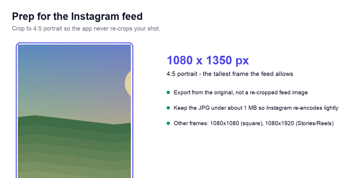
- Feed portrait (recommended): 1080x1350 px, 4:5 ratio, JPG, under ~1 MB
- Feed portrait (tallest allowed): 1080x1440 px, 3:4 ratio, JPG, under ~1.1 MB
- Feed square: 1080x1080 px, 1:1 ratio, JPG, under ~700 KB
- Feed landscape: 1080x566 px, 1.91:1 ratio, JPG, under ~500 KB
- Reels cover and Stories: 1080x1920 px, 9:16 ratio, JPG, under ~1.2 MB
- Carousel: every card 1080x1350 px (4:5), identical ratio across all 10 slides
- Profile photo: upload 320x320 px minimum; it renders as a circle about 110 px wide on mobile
Export settings that survive Instagram's re-encode
Instagram re-encodes every JPG you upload, so your job is to hand it a file it barely needs to touch. Export at JPEG quality 82 to 90 (roughly 0.82 to 0.90 on a 0 to 1 scale). Below 80 you ship visible blocking that the platform pass then compounds; above 92 you only inflate the file and trigger heavier server compression. A clean 1080x1350 photo at quality 85 typically lands around 300 to 600 KB, which clears the ~1 MB threshold comfortably.
Convert to the sRGB color profile before export. Files tagged Adobe RGB or Display P3 get flattened to sRGB on upload, and the conversion dulls saturated reds and greens. Strip embedded ICC profiles and EXIF to shave 20 to 60 KB and avoid a forced color shift. Apply output sharpening at the final 1080 px width, not at full resolution, or the detail you added gets resampled away during downscale. For flat graphics, solid-color quote cards, or screenshots with crisp text, export PNG-24 instead; JPEG at any quality fringes hard type and color edges. Compress Image lets you tune the JPEG level and confirm the byte count before upload.
Safe-zone margins so the interface never covers your subject
Instagram paints its own UI over the full 1080x1920 Reels and Stories frame, so anything important near the edges gets buried under buttons. Keep faces, logos, captions, and product detail inside a central column roughly 1080 px wide by 1420 px tall, centered vertically in the canvas. The usable region runs from about 200 px down from the top to about 250 px up from the bottom.
On feed posts the crop math bites in the grid: a 1080x1350 portrait is center-cropped to a 1:1 thumbnail on your profile, trimming roughly 135 px off the top and bottom. Keep the subject within the central 1080x1080 square if the grid preview matters. For carousels, frame the first card conservatively because the feed shows it before anyone swipes.
- Reels and Stories top margin: keep 108 px clear of the time and account row
- Reels bottom margin: keep 320 px clear of the caption, audio label, and share row
- Reels right margin: keep 120 px clear of the like, comment, share, and save icons
- Feed grid: expect a 1080x1350 post cropped to its center 1080x1080 in the profile grid
- Carousel and feed: stay 60 to 80 px inside every edge to absorb device-specific cropping
Worked example: one shot prepped for feed and story
Start with a single 4032x3024 phone photo and prepare it for two surfaces so Instagram never crops it for you. For the feed, crop to 1080x1350 px (4:5 portrait, the tallest the feed allows) with the Crop Image tool and export JPG at quality 85 — it lands near 600 KB, well under the ~1 MB point where Instagram re-compresses hard. For a Story or Reel cover, crop the same source to 1080x1920 px (9:16) and keep the subject inside the central safe zone so the interface chrome does not cover it.
Exporting both from the original 4032 px file — rather than re-cropping an already-compressed feed image — keeps each version sharp, because every extra re-encode on top of Instagram’s own pass is where mobile images visibly soften.
Related tools
Resize, crop, convert, or compress the image before upload with the tools below — all in your browser, no account needed.