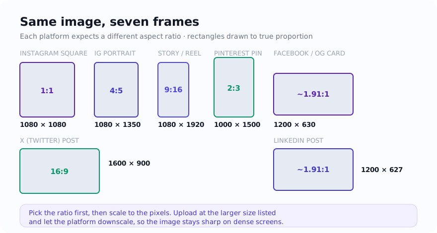
Simple rule: use exact presets when the platform frame is fixed, and choose between fit and fill based on whether keeping the whole image matters more than full edge-to-edge coverage.
Choose the placement before the pixel size
Start with the shape of the placement: square or 4:5 for many feed compositions, 9:16 for full-screen vertical placements, a wide frame for link previews or thumbnails, and a shallow banner for headers. Then confirm the current platform guidance and composer preview. This avoids maintaining two overlapping size tables and keeps the decision focused on composition.
- Feed image: choose the ratio that presents the subject clearly and check the current feed and profile-grid previews.
- Story or reel: start with a vertical frame and keep essential text away from interface controls visible in the current preview.
- Link card or thumbnail: use the destination’s documented ratio and test how its scraper or uploader crops the image.
- Cover or banner: expect different crops across screen sizes and keep essential content near the centre.
Fit vs fill
Fit keeps the whole image visible inside the target frame. That is useful when you cannot afford to lose any part of the subject, such as logos, product images, or text-heavy graphics. The tradeoff is that you may need background space around the image.
Fill crops the image to fully cover the target frame. That usually looks stronger for photos, thumbnails, and social designs, but it can cut off edges or text if the original composition is too tight.
When a background helps
Background padding is a good choice when the source image is already composed correctly but the platform shape does not match. Instead of forcing a crop, add a background that feels intentional and matches the visual context of the final post.
That is especially helpful for ecommerce images, screenshots, logos, and preview cards where the full subject needs to stay intact.
Practical workflow
- Start with the exact platform preset instead of resizing manually.
- Choose fit mode if the full image must remain visible.
- Choose fill mode if edge-to-edge coverage matters more than preserving every edge.
- Review text and faces near borders before exporting.
- Compress the final export if the platform or website still needs a lighter file.
Per-platform planning reference
The numbers below are common working canvases, not permanent specifications or a promise about display. Platform surfaces and upload behavior change, so check the linked official help pages and the current composer before preparing a batch. A larger file is not automatically better when the source lacks detail or the destination applies its own processing.
| Platform | Surface | Common size | Aspect ratio |
|---|---|---|---|
| Feed square | 1080 × 1080 | 1:1 | |
| Feed portrait | 1080 × 1350 | 4:5 | |
| Stories / Reels | 1080 × 1920 | 9:16 | |
| Feed / link preview | 1200 × 630 | ~1.91:1 | |
| Page cover | 820 × 312 | ~2.63:1 | |
| X (Twitter) | In-stream image | 1600 × 900 | 16:9 |
| X (Twitter) | Profile header | 1500 × 500 | 3:1 |
| Post / shared link | 1200 × 627 | ~1.91:1 | |
| Personal cover | 1584 × 396 | 4:1 | |
| Standard pin | 1000 × 1500 | 2:3 | |
| YouTube | Video thumbnail | 1280 × 720 | 16:9 |
| YouTube | Channel banner | 2560 × 1440 | 16:9 |
Each surface needs a preview check. A portrait feed frame offers more vertical composition space than a square, while wide in-stream images and channel banners may receive different crops across layouts and devices. Keep the subject and essential text away from uncertain edges, and do not infer an engagement advantage from the frame alone.
Aspect ratios and safe zones
Pixel dimensions matter less than the aspect ratio behind them. An image at 1080 × 1920 and one at 720 × 1280 are both 9:16 and will sit in a vertical frame the same way, just at different resolutions. Picking the ratio first, then scaling to the recommended pixels, prevents most surprise crops.
A safe area is the central region you reserve for essential content after checking the current interface. It matters most on vertical and cover formats:
- Stories and Reels: keep headlines, logos, and faces away from the top and bottom controls shown in the current composer preview.
- YouTube channel banner: follow YouTube’s current documented safe area and preview the banner on multiple device layouts.
- Cover and header images: expect desktop and mobile crops to differ, so leave breathing room around text and logos near the edges.
Crop vs pad to hit a ratio
When your source image does not match the target ratio, you have two clean options that avoid stretching. Stretching to force a fit distorts faces and straight lines, so it is rarely the right move.
- Crop when the composition can lose some edge without hurting the message, such as a wide landscape going into a 9:16 Story. This is the fill approach and usually looks strongest for photos and thumbnails.
- Pad (letterbox) when every part of the image must stay intact, such as a product shot, screenshot, infographic, or logo lockup. Adding a solid or branded background to reach 1:1 or 4:5 keeps the subject whole, which is the fit approach.
For supported inputs, both crop and pad transform the selected file on the device rather than sending it to the site server for that operation; ordinary page and consent-controlled service requests can still occur. Keep a high-quality master, then crop or pad separate copies for each surface.
Tools for sizing each social export
Use Social Media Resizer when you want its listed presets and export options. Use Add Background to Image when you want to contain-resize the full image onto a chosen opaque canvas without platform-specific presets.
Related guides
Sources and verification
- Instagram Help Centre — check the current composer and placement guidance.
- Meta Ads Guide — current placement and creative specifications for Meta advertising workflows.
- YouTube Help: Manage channel branding — current banner dimensions, safe-area guidance, and crop behavior.
- LinkedIn Help: Share photos — current photo ratios, minimums, and multi-image behavior.
FAQ
What is the difference between fit and fill for social images?
Fit keeps the whole image visible and adds space when needed. Fill crops the image so the frame is completely covered.
Do all social platforms use the same image size?
No. Each platform and surface can use different aspect ratios and dimensions, which is why presets are useful.
Which size is common for Open Graph cards?
A common Open Graph image size is 1200 by 630 pixels.