Why image optimization moves the needle
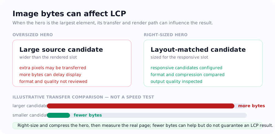
Core Web Vitals include a metric for how quickly the largest visible element — frequently a hero image — finishes rendering. Oversized images can delay that moment and cost visitors data, especially on mobile. Whether image work is the highest-impact fix depends on the page, so measure before and after instead of assuming.
There are four levers to inspect; measurement determines their order for a particular page:
- Dimensions — avoid sending substantially more pixels than the layout needs.
- Format — compare suitable formats using the actual image and destination support.
- Compression — reduce bytes while checking the details that matter at the intended display size.
- Loading behaviour — let the browser defer and reserve space for images so they do not block or shift the page.
Optimize the image before fixing the markup
1. Resize to the real display size
This is a common source of waste: placing a full camera export into a much narrower layout slot. Measure how wide the image actually renders at representative breakpoints, then use the Image Resizer to create suitable responsive candidates. A high-density display may need a larger candidate, and responsive markup can let the browser choose.
2. Choose the right format
- Photographs → compare JPG, WebP, and AVIF using the actual image and destination support. WebP often reduces size, but the result is content- and encoder-dependent.
- Logos, icons, screenshots with sharp edges or transparency → keep PNG when exact pixels matter, or compare a WebP delivery copy and inspect its lossy output.
- Simple icons that need to scale → SVG, where you have it.
If you are weighing formats, the WebP vs JPG vs PNG and AVIF vs WebP vs JPG guides go deeper.
3. Compress what is left
After resizing and converting, run a copy through Compress Image and compare several outputs at the intended display size. Stop before text, product detail, faces, or gradients show unacceptable artifacts; there is no universal quality setting.
4. Fix the markup, not just the file
A small file still hurts if the page handles it badly. Three quick wins:
- Consider lazy-loading below-the-fold images with
loading="lazy". It is a browser hint and the browser may fetch ahead of the scroll position. Avoid applying it by default to a likely largest-contentful image such as the main hero. - Set
widthandheight(or reserve the aspect ratio in CSS) so the browser can allocate space before the image arrives and reduce layout shifts. - Write descriptive
alttext. It helps screen-reader users, gives search engines context, and is what shows if the image fails to load.
A worked hero-image example
A blog hero photo starts as a large camera export but is displayed in a much narrower content column.
- Measure the rendered slot at representative breakpoints, then create responsive candidates instead of sending the full camera dimensions everywhere. Include enough detail for higher-density displays without assuming one multiplier fits every layout.
- Compare formats such as JPG and WebP with the real photo. Inspect hair, foliage, gradients, text overlays, and other areas that reveal encoder artifacts.
- Compress a copy until further byte savings cause an unacceptable visible change at the intended display size.
- Fix the markup: provide responsive sources where appropriate, reserve the aspect ratio with dimensions or CSS to reduce image-caused shifts, write useful
alttext, and avoid lazy-loading a likely hero/LCP image by default.
Measure the page before and after. Network conditions, caching, server response, image priority, responsive selection, and layout all affect when the hero renders, so a smaller file alone is not a performance guarantee.
Related tools
- Image Resizer — create dimensions that match the intended layout.
- JPG to WebP — convert photos to a smaller modern format.
- Compress Image — tune the final file toward a measured performance or upload target.
- PNG to WebP — compare a lossy WebP delivery copy for suitable graphics and transparent images.
How the selected image is handled
For supported files, resizing, conversion, and compression process the selected image on the device. Ordinary page, library, diagnostic, and consent-controlled service requests can still occur; those requests do not contain the selected image for these transformations.
Use the tool: Resize Image — free, with selected-file processing performed on the device for supported inputs.
Related guides
Sources and verification
- web.dev: Learn Images — Responsive delivery, dimensions, compression, and performance guidance.
- Google Search Central: Image SEO best practices — Google’s current image discovery and indexing guidance.
Frequently asked questions
What is the single most effective way to optimize images for the web?
Match image candidates to the sizes the layout actually displays. Sending a full camera export into a much smaller slot can waste bandwidth, while responsive image markup lets the browser choose an appropriate candidate.
Which image format is best for website speed?
There is no universal winner. Compare JPG, WebP, and AVIF for photographs using the source image and destination support. Use PNG when lossless storage of rendered pixels is required, compare transparency-capable WebP carefully, and use SVG for suitable vector artwork.
Does image optimization actually help SEO?
It can improve loading performance and user experience. Core Web Vitals are part of Google's page-experience systems, but image optimization does not guarantee a ranking change and should be measured on the actual page.